현재 최신 버전 : ComponentOne 2023 v3 | Wijmo 2023 v2 | Spread.NET v17 | SpreadJS v17 | ActiveReports.NET v18 | ActiveReportsJS v4.2 | Forguncy v9 | DsExcel v7

고성능 Web App을 위한
JavaScript UI 컨트롤
List of Services
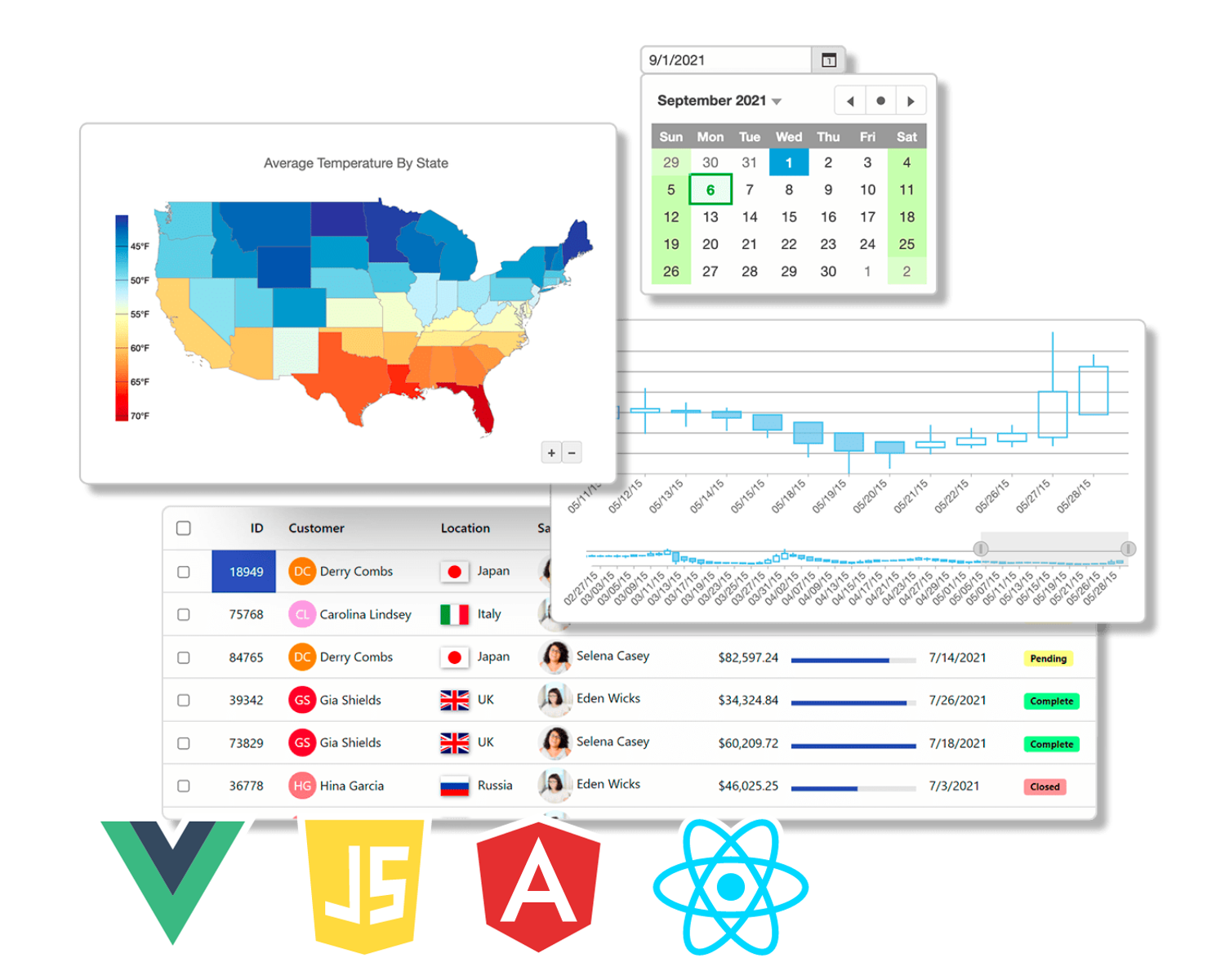
Wijmo를 통해 강력한 퍼포먼스를 자랑하는 HTML5/JavaScript 앱을 구현해 보세요.
- Angular, React, Vue.JS 공식 지원
- 필터, 그룹화, 정렬 기능 지원
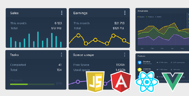
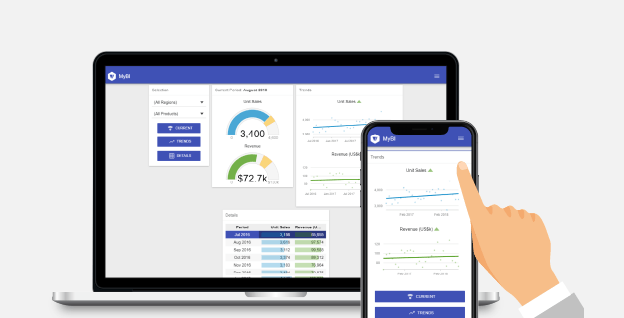
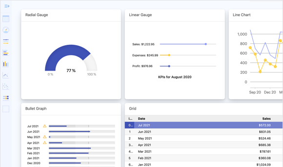
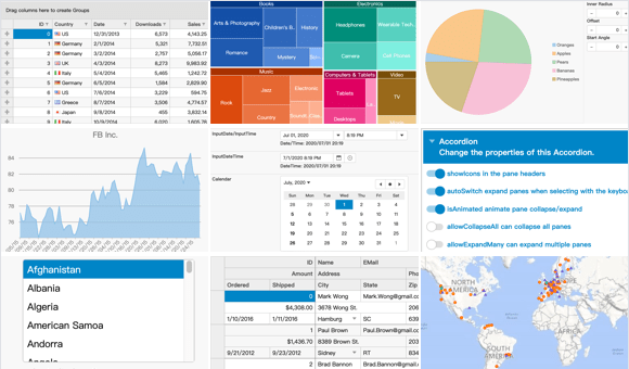
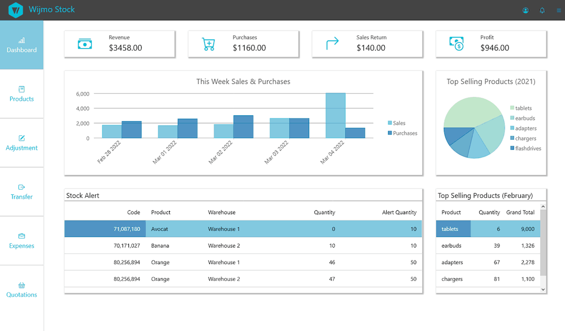
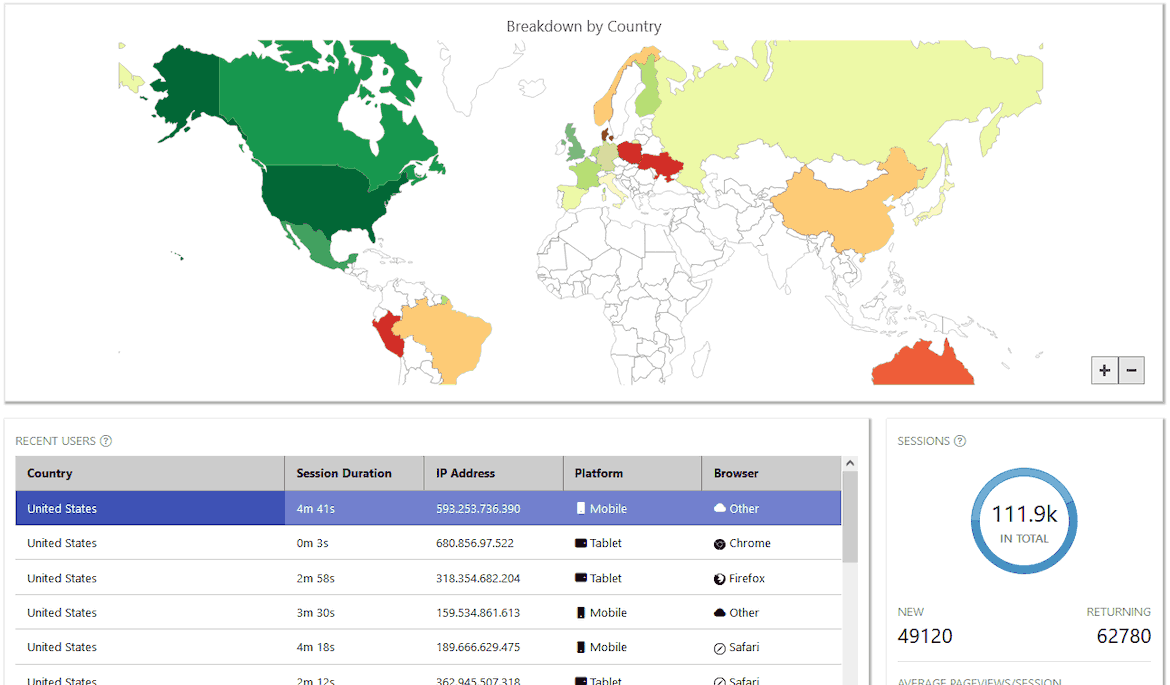
- 그리드, 80+ 차트, 리포트, 입력 폼, 캘린더, OLAP 등 100+ UI 컨트롤 지원
- 다양한 기능이 추가된 2023 v2 출시!
- (중요!) Google Chrome 정책 변경으로 인한
Wijmo 업그레이드 및 코드 수정 안내
아래는 실제 Wijmo 화면입니다. HTML/CSS/JS 각 탭을 클릭하여 코드를 확인하고, 직접 코드를 수정하여 그에 따른 결과도 확인해 보세요.

-
Area

-
Donut

-
Grid

-
Gauge

-
Bar
-
See the Pen by GrapeCity Korea ( @GrapeCity-Korea ) on CodePen.
-
See the Pen by GrapeCity Korea ( @GrapeCity-Korea ) on CodePen.
-
See the Pen by GrapeCity Korea ( @GrapeCity-Korea ) on CodePen.
-
See the Pen by GrapeCity Korea ( @GrapeCity-Korea ) on CodePen.
-
See the Pen by GrapeCity Korea ( @GrapeCity-Korea ) on CodePen.
왜 Wijmo를 사용해야 할까요?
최신 Front-End 개발 기술을 모두 반영한 유일하고 완벽한 JavaScript 컨트롤인 Wijmo를 통해
웹부터 모바일에 이르기까지 성능에 타협하지 않는 완벽한 웹 솔루션을 개발할 수 있습니다.

빠르고 가벼운 JavaScript 컴포넌트
Wijmo 컴포넌트는 웹 앱의 크기를 절대 부풀리지 않습니다! 최고의 성능을 위해 제작된 Wijmo 컴포넌트는 종속성이 없을 뿐만 아니라 작고 확장 가능하며 고성능으로 제작되었습니다.

유연하고 확장 가능한 API
가독성이 높고 유연한 API는 학습 곡선이 낮으며, 각 컴포넌트에는 가능한 한 많은 확장 지점을 지원합니다.

보안 수준
CSP(콘텐츠 보안 정책)를 통해, 개발자는 XSS(Cross-Site Scripting) 및 데이터 삽입 공격을 비롯한 특정 유형의 공격을 감지하고 이를 최소화 할 수 있습니다. Wijmo는 CSP를 완전히 준수합니다. 또한 PDF 보안은 사용자 및 소유자로서 PDF 파일을 암호로 보호하는 기능을 제공합니다.
친숙하고 접근성이 뛰어난 터치 우선 UI
차트, 데이터 그리드 및 다양한 컴포넌트는 Excel과 유사한 필터링, 정렬 및 병합을 포함한 친숙한 기능 및 UI를 사용하여 모바일 우선으로 설계되었으며 ARIA 표준을 준수합니다.
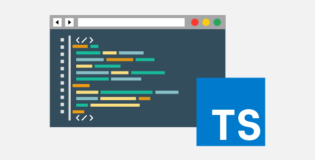
TypeScript로 작성된 최첨단 True JavaScript 컴포넌트
TypeScript를 사용하면 객체지향 언어인 C#/Java의 느낌으로 개발이 가능하며, 디자인 타임 오류 검사 및 완전한 IntelliSense 기능을 얻을 수 있습니다. 진정한 JavaScript 컴포넌트인 Wijmo는 ECMAScript 6 표준에 작성됩니다.


Wijmo 튜토리얼
Wijmo는 500개 이상의 샘플 코드를 제공하며, 이를 통해, Wijmo의 컨트롤들을 Angular, React, Vue 상에서 구현하는 방법을 학습할 수 있습니다. 아래 링크를 통해, Wijmo의 다양한 컨트롤들을 지금 사용해 보세요.
전체 튜토리얼
최신 모던 JavaScript 프레임워크 기반에서 Wijmo를 구현하고자 하시는 개발자분들을 위한 다양한 데모/튜토리얼을 확인하실 수 있습니다.
PureJS(SystemJS) | Angular | React | Vue
아래 동영상을 통해 Wijmo에서 Chart와 Grid 기능을 사용하는 방법을 학습할 수 있습니다.
MESCIUS 개발자 포럼
-

Wijmo 블로그 & Tips
Wijmo를 유용하게 활용할 수 있도록 다양한 정보를 제공합니다.
-

Wijmo Q&A
질문/답변 공간을 통해, 시티즌 여러분들의 고민과 개발 지식을 함께 공유해 주세요.
-

Wijmo FAQ
자주 묻는 질문에 대한 답변을 확인하실 수 있습니다.
-

시티즌 인사이트
업무 중 피로나 스트레스를 조금이라도 덜어드리고자 만든 공간입니다. 자유롭게 소통하세요.
-

시티즌 지식인
MESCIUS 제품 관련 질문 외에도, 개발/기술과 관련하여 모든 분들이 자유롭게 질문하고 소통할 수 있는 공간입니다.
-

IT 세미나 / 모임
개발자분들이나 개발에 관심이 있으신 분들을 위해, 함께 발전할 수 있도록 만들어진 만남의 공간입니다.
Wijmo 디자이너를 통해 Wijmo 컨트롤 설정을 쉽게 변경해 보세요.

Web 디자이너를 통해 Wijmo 컨트롤들의 설정을 쉽게 변경해보세요. 20가지 이상의 컨트롤들의 설정 값을 수정하고 확인해 볼 수 있습니다. 별도의 코딩 작업 없이도, 해당 설정을 다운로드 받아 여러분의 웹에 쉽고 빠르게 바로 적용이 가능합니다.
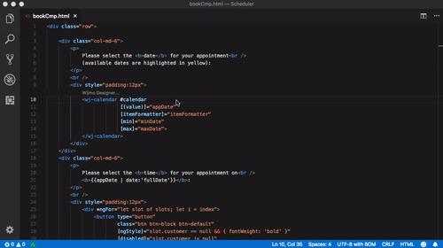
Angular 개발자 분들을 위한 전용 VS Code 확장 기능을 제공합니다. 20가지 이상의 Wijmo 컨트롤에 대한 설정을 디자이너를 통해 변경할 수 있으며, 자동으로 HTML 소스 파일에 적용이 됩니다. 확장 기능을 이용하여 Mark-up 태그 자동완성 기능과 디자이너 UI를 통해 쉽게 개발이 가능합니다.
Wijmo 2023 v2 새로운 기능

- Angular 17 지원
- FlexChart에 차트 축 그룹화 추가
- 새로운 도구 설명 트리거
- 강력해진 안정성과 고품질
- 사용 사례 포함 단위 및 자동화 테스트 확장


Wijmo 무료 체험판


구매 절차
구매 절차의 각 단계에 대한 자세한 내용을 보시려면 각 버튼을 클릭해주세요.
Web 개발자를 위한 컨트롤

SpreadJS
순수 JavaScript 기반 Web-Excel 컴포넌트
- Excel 가져오기/내보내기 지원
- 450+ Excel 함수 지원
- Angular, React, VueJS 지원
더 알아보기
ActiveReportsJS
JavaScript 기반 비즈니스 리포팅 컴포넌트
- Angular, React, Vue 지원
- 크로스플랫폼을 지원하는 디자이너 프로그램 제공
- JavaScript 리포트 뷰어 제공
더 알아보기
Forguncy
코딩 없이 Excel로 만드는 비즈니스 웹 개발 솔루션
- Excel 기능으로 쉽고 빠르게 웹 구현
- HTML & CSS 없이 시작하는 웹 개발
- 데이터 취합 및 통합 솔루션
더 알아보기
DsExcel
고성능 Java&Kotlin / .NET 기반 Excel 스프레드시트 API 라이브러리
- 스프레드시트 생성, 로드, 편집, 저장
- 스프레드시트 구문 분석, 변환, 공유
- 수식 계산 및 셀 서식 지정
DsExcel Java 알아보기DsExcel .NET 알아보기